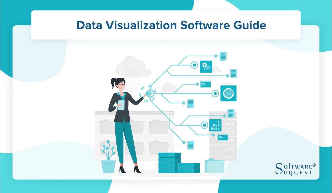
Best Data Visualization Tools
Leading data visualization tools comprise Tableau, Microsoft Power BI, Google Charts, Plotly, and DataWrapper. Such top-tier data visualization software help to transform data into visually engaging representations. Compare & choose the top-rated data visualization software as per your needs. All software listed by pricing, by genuine customer rating & reviews, by features, by industry wise, by business type, by device supported. Schedule FREE demo now.


No Cost Personal Advisor
List of 20 Best Data Visualization Tools
Emergents | 2024
Empower all types of users to access and process d
Oracle Analytics Cloud is a cloud native platform that offers a complete solution with embedded machine learning that delivers insights for all data to business users, data engineers and data scientists. Learn more about Oracle Analytics Cloud
Explore various Oracle Analytics Cloud features, compare the pricing plans, and unlock the potential of seamless operations by selecting the right software for your business.
- Data Discovery
- Data Analysis
- Data Visualization
- Online Analytical Processing (OLAP)
- Data Capture
- Machine Learning
- Data Classification
- Ad Hoc Reports
Oracle Analytics Cloud Caters to
- StartUps
- SMBs
- Agencies
- Enterprises
High Performer | 2024
Uncomplicate data and analyze information effortlessly
It helps break down complex data and simplifies business intelligence to help firms analyze, understand and overcome problems. This data visualization software analyses big and disparate datasets, allowing you to visualize information effectively. Read Sisense Reviews
Explore various Sisense features, compare the pricing plans, and unlock the potential of seamless operations by selecting the right software for your business.
Features
View all Sisense Features- Extract
- transform and load (ETL)
- Data Analysis
- Visualization / Presentation
- Scorecarding
- Dashboard
- Ad hoc Query
- Ad hoc Analysis
Sisense Caters to
- StartUps
- SMBs
- Agencies
- Enterprises
Emergents | 2024
Empower your organization through improved data visibility
Datapine allows businesses to gain valuable insights through advanced reporting tools. This data visualization tool offers several self-service analytics functions with an intuitive UI that helps even non-technical users understand key data points. Learn more about datapine
Explore various datapine features, compare the pricing plans, and unlock the potential of seamless operations by selecting the right software for your business.
Features
View all datapine Features- Collaboration
- Social Media Metrics
- Project Management
- Scheduling
- Data Management
- Exception Reporting
- Trend / Problem Indicators
- Data filtering
datapine Caters to
- StartUps
- SMBs
- Agencies
- Enterprises
Emergents | 2024
Unite business data using the best data visualization tool
Allows organizations to create data visualizations that are simple yet helpful by collating information from multiple sources. It is often hailed as the best data visualization tool for geographical calculations. Read QlikSense Reviews
Explore various QlikSense features, compare the pricing plans, and unlock the potential of seamless operations by selecting the right software for your business.
Features
View all QlikSense Features- Filtered Views
- Online Analytical Processing (OLAP)
- Relational Display
- Dashboard Creation
QlikSense Caters to
- StartUps
- SMBs
- Agencies
- Enterprises
Emergents | 2024
Enhance real-time data visibility for better business prospects
Dundas BI is a modern business intelligence tool that integrates your existing applications and allows you to gain real-time insights. It is fully customizable and is especially suitable for mid-sized firms. Read Dundas BI Reviews
Explore various Dundas BI features, compare the pricing plans, and unlock the potential of seamless operations by selecting the right software for your business.
Features
View all Dundas BI Features- Dashboard
- Content Management System
- Data Quality management
- Ad Hoc Reports
- Predictive Analytics
- Ad hoc Query
- Ad hoc Analysis
- Dashboard Creation
Dundas BI Caters to
- StartUps
- SMBs
- Agencies
- Enterprises
Contenders | 2024
Analyze your data skillfully to make informed decisions
Zoho Analytics empowers your business by offering in-depth insights through dashboards and reports. It provides a range of Business Intelligence tools that help you compete successfully. Read Zoho Analytics Reviews
Explore various Zoho Analytics features, compare the pricing plans, and unlock the potential of seamless operations by selecting the right software for your business.
Features
View all Zoho Analytics Features- KPIs
- Performance Management
- Visualization / Presentation
- Reporting/Analytics
- Self Service Data Preparation
- ETL - Extract / Transfer / Load
- Report writers
- Data Analysis
Pricing
Free
$ 0
Per Month
Basic
$ 17
Per Month
Standard
$ 33
Per Month
Zoho Analytics Caters to
- StartUps
- SMBs
- Agencies
- Enterprises
Emergents | 2024
The favorite tool of data visualization experts
FusionCharts caters to the needs of rapidly evolving firms and SMEs through its end-to-end solutions. Business data visualization tool allows you to create bar charts, line charts, and pie charts and utilize your data to populate dashboards for enhanced visual discovery. Learn more about FusionCharts
Explore various FusionCharts features, compare the pricing plans, and unlock the potential of seamless operations by selecting the right software for your business.
Features
View all FusionCharts Features- Filtered Views
- Visual Discovery
- Relational Display
- Dashboard Creation
FusionCharts Caters to
- StartUps
- SMBs
- Agencies
- Enterprises
Emergents | 2024
Intuitive visualization that benefits your business
Visually helps businesses of all sizes draw insights from their existing data. This big data visualization tool offers several powerful features to filter information and present it in the desired format. Learn more about Visually
Explore various Visually features, compare the pricing plans, and unlock the potential of seamless operations by selecting the right software for your business.
Features
View all Visually Features- Simulation Models
- Relational Display
- Online Analytical Processing (OLAP)
- Analytics
- Dashboard Creation
- Filtered Views
Visually Caters to
- StartUps
- SMBs
- Agencies
- Enterprises
Emergents | 2024
Seamless data management and visualization powered by innovation
It helps your business manage huge data pools and allows you to visualize, filter, and segregate information effortlessly. This data visualization tool also offers a free trial of 15 days. Learn more about DataHero
Explore various DataHero features, compare the pricing plans, and unlock the potential of seamless operations by selecting the right software for your business.
Features
View all DataHero Features- Budgeting & Forecasting
- Key Performance Indicators
- Data Visualization
- Data Analysis
- Extract
- Profitability Analysis
- Ad hoc Analysis
- Report writers
DataHero Caters to
- StartUps
- SMBs
- Agencies
- Enterprises
Emergents | 2024
Get up to speed with competitors through rich data insights
Analyze data in minutes and take your business places with highly productive data handling from Zoomdata. This data visualization platform helps you swiftly identify and remove complexities from your processes. Learn more about Zoomdata
Explore various Zoomdata features, compare the pricing plans, and unlock the potential of seamless operations by selecting the right software for your business.
Features
View all Zoomdata Features- Dashboard Creation
- Filtered Views
- Analytics
- Simulation Models
- Online Analytical Processing (OLAP)
- Relational Display
- Visual Discovery
Zoomdata Caters to
- StartUps
- SMBs
- Agencies
- Enterprises
Emergents | 2024
The best data visualization tools for mid-sized companies
Offers interactive dashboards that can be drilled down further to get those minute insights that can make all the difference in your business. The platform ensures that you never miss a detail and improves business accuracy. Learn more about Cluvio
Explore various Cluvio features, compare the pricing plans, and unlock the potential of seamless operations by selecting the right software for your business.
Features
View all Cluvio Features- Visual Discovery
- Analytics
- Filtered Views
- Dashboard Creation
- Simulation Models
- Relational Display
Pricing
Starter
$ 111
Per Month
Pro
$ 278
Per Month
Business
$ 669
Per Month
Cluvio Caters to
- StartUps
- SMBs
- Agencies
- Enterprises
Emergents | 2024
Visualize data in multiple ways to match your business needs
It allows you to derive information from multiple data pools and create and customize your visualizations. It is highly flexible and offers super-fast processing speeds. Learn more about Vizydrop
Explore various Vizydrop features, compare the pricing plans, and unlock the potential of seamless operations by selecting the right software for your business.
Features
View all Vizydrop Features- Filtered Views
- Visual Discovery
- Simulation Models
- Online Analytical Processing (OLAP)
- Dashboard Creation
- Relational Display
- Analytics
Vizydrop Caters to
- StartUps
- SMBs
- Agencies
- Enterprises
Contenders | 2024
The best data visualization Tools for large enterprises
Microsoft Power BI’s data visualization tool is ideal for large enterprises managing internal and client data. It allows you to handle large datasets and get prompt insights without any manual intervention. Read Microsoft Power BI Reviews
Explore various Microsoft Power BI features, compare the pricing plans, and unlock the potential of seamless operations by selecting the right software for your business.
Microsoft Power BI Caters to
- StartUps
- SMBs
- Agencies
- Enterprises
Contenders | 2024
Unleash the power of data to reap massive business benefits
A data visualization tool that is designed to help you reach your desired business outcomes. It is highly flexible and user-friendly, allowing even laypeople to derive key insights without much hassle. Read Databox Reviews
Explore various Databox features, compare the pricing plans, and unlock the potential of seamless operations by selecting the right software for your business.
Features
View all Databox Features- Budgeting & Forecasting
- Dashboard
- Data Mining
- Ad hoc Query
- Trend / Problem Indicators
- Key Performance Indicators
- Ad hoc Analysis
- Ad Hoc Reports
Pricing
Free
$ 0
Per Month
Basic
$ 59
Per Month
Business
$ 299
Per Month
Databox Caters to
- StartUps
- SMBs
- Agencies
- Enterprises
Emergents | 2024
Affordable online data visualization tool that needs no additional setup
Easy Insight is a SaaS-based data visualization software that offers a powerful set of visualization functionalities at affordable prices. It requires no additional setup costs and can automatically filter out duplicate/irrelevant data. Learn more about Easy Insight
Explore various Easy Insight features, compare the pricing plans, and unlock the potential of seamless operations by selecting the right software for your business.
Features
View all Easy Insight Features- Dashboard
- Data Mining
- Data Analysis
- Key Performance Indicators
- Data Visualization
- Performance Management
- Scorecarding
- Online Analytical Processing (OLAP)
Pricing
Basic
$ 50
Per Month
Easy Insight Caters to
- StartUps
- SMBs
- Agencies
- Enterprises
Emergents | 2024
Powerful visual statistics for create interactive maps
Create visualizations, measure, compare and evaluate organizational performance along with website and social media metrics using different data visualization techniques, all through a single intuitive interface, saving you a great deal of time and effort. Learn more about Whatagraph
Explore various Whatagraph features, compare the pricing plans, and unlock the potential of seamless operations by selecting the right software for your business.
Features
View all Whatagraph Features- Website Analytics
- Performance Metrics
- Social Media Metrics
- Dashboard
Pricing
Pro
$ 30
month
Business
$ 70
month
Agency
$ 399
month
Whatagraph Caters to
- StartUps
- SMBs
- Agencies
- Enterprises
Emergents | 2024
Gain timely insights that help transform your business
Adaptive Insights is a best data visualization software that specilizes in accounting and financial reporting. It helps you better your bottom line and allows you to make better fiscal choices for your brand. Learn more about Adaptive Insights
Explore various Adaptive Insights features, compare the pricing plans, and unlock the potential of seamless operations by selecting the right software for your business.
Features
View all Adaptive Insights Features- Accounting
- Billing & Invoicing
- Tax Management
- Accounting Management
- Multi-Currency
- Payroll Management
- Income Statements
- Fixed assets
Pricing
Regular
$ 50
User/Month
Adaptive Insights Caters to
- StartUps
- SMBs
- Agencies
- Enterprises
Contenders | 2024
Innovative big data visualization tools for emerging businesses
Business intelligence tool that helps you improve your ROI, business performance, and sales simultaneously. The application is created for small and medium-sized industries looking for professional expertise in data management. Read Looker Reviews
Explore various Looker features, compare the pricing plans, and unlock the potential of seamless operations by selecting the right software for your business.
Features
View all Looker Features- Data Analysis
- Dashboard
- Predictive Analytics
- Key Performance Indicators
- Ad Hoc Reports
- Data Visualization
- Visualization / Presentation
- Performance Management
Looker Caters to
- StartUps
- SMBs
- Agencies
- Enterprises
Emergents | 2024
Present, analyze, and simulate data for better predictions
It understands key data points and provides accurate forecasts for both SMEs and enterprises. Ploty offers a variety of simulation models to help you predict outcomes faster. Learn more about Plotly Dash
Explore various Plotly Dash features, compare the pricing plans, and unlock the potential of seamless operations by selecting the right software for your business.
Features
View all Plotly Dash Features- Simulation Models
- Dashboard Creation
Plotly Dash Caters to
- StartUps
- SMBs
- Agencies
- Enterprises
Emergents | 2024
Merge, analyze, and present information in a hassle-free way
Empower your organization through powerful data points from Datawarpper. This online data visualization tool is packed with innovative features to help you understand data from various perspectives. Learn more about Datawrapper
Explore various Datawrapper features, compare the pricing plans, and unlock the potential of seamless operations by selecting the right software for your business.
Features
View all Datawrapper Features- Simulation Models
Datawrapper Caters to
- StartUps
- SMBs
- Agencies
- Enterprises
Get Free Expert Advice

Recent Review
What is Data Visualization?
Data visualizations are the graphical representation of data and information for easy understanding. It uses tables, creates charts and graphs, and creates maps to visualize data and identify trends, patterns, and outliers.
We live in a world of big data, where data visualization tools are necessary to analyze vast information and make intelligent decisions. A good visualization tool helps remove noise and distractions to highlight significant trends in the current business ecosystem. Practical data visualizations balance function and form.
Sometimes, the most appealing data visualizations may fail to convey the right trend. Thus, there’s a need for data and visuals to work together to bring out accurate information.
What is Data Visualization Tool?
Data visualization tools are software applications that display information in a visual format, such as a graph, chart, or heat map, for data analysis. Such Bi Visualization tools facilitate understanding and working with massive amounts of data.
Open-source visualization software can pull data from different sources, including spreadsheets and other existing applications like CRM, and build an appealing visual. In addition, it comes equipped with various graphic styles based on your data to help you better understand important metrics. For instance, it builds interactive and dynamic maps for geographical data, a pie chart for data distribution, and more.
All in all, using a data visualization system eliminates the need for employees to dig into and visualize data from different locations and have all data centralized. Data visualization tools are the best solutions for businesses looking for a visual analytical board. Setting up a data visualization solution is relatively easy compared to other business intelligence tools.
How Importance is Data Visualization Software for Business?
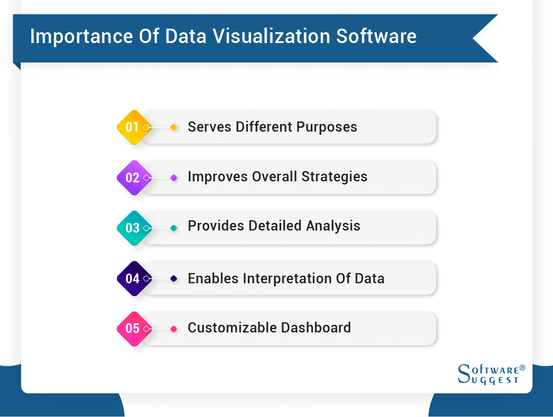
Here are a few benefits of using the best data visualization software.
-
Serves Different Purposes
The good thing about online data visualization tools is that all employees have equal opportunities to utilize data visualization software. For instance, the sales team can track revenue and the number of deals closed. At the same time, they can keep track of other important KPIs, including the number of calls made, track employee performance, etc.
Similarly, recruiters or hiring managers can check how many applications have been submitted for specific roles, monitor the number of times job postings have been viewed, and other HR metrics. Again, having a single dashboard for different departments to display the information is advantageous.
-
Improves Overall Business Strategies
The good thing about Interactive data visualizations is that it track data in real-time, allowing businesses to identify trends and act upon them quickly. For example, the visual can reveal how far you are from achieving your monthly, quarterly, and yearly goals. Based on the final result, you can re-work your strategies to achieve your goals. Having a better understanding of all data allows you to run your business better, and using visualization software also helps bring digital transformation to your organization.
-
Provides Detailed Analysis of Business Performance
Another advantage of data visualization is that it tracks information in real time and provides visuals for easy understanding. As a result, companies can easily track metrics for different departments and teams. These visuals help businesses understand how their organization performs and identify which area needs improvement. The primary metrics include customer retention, churn, marketing expense, etc.
The best data visualization tools, including CRM software, can easily pull this information from different sources.
-
Enables Easy Interpretation of Data
Data visualization tools help users understand critical business intelligence data. With the help of data visualization tools, non-analyst employees can quickly interpret data. Thus, employees can easily re-align their goals and objectives based on the data interpretation and work towards overall company growth.
-
Incorporates a Customizable Dashboard
There are no one-size-fits-all business solutions. Every company and department needs access to various types of critical business data. A customizable dashboard can pull data from multiple sources and display visuals per the requirements. It enables employees to understand essential data with ease.
What are the Key Features of the Data Visualization Tool?
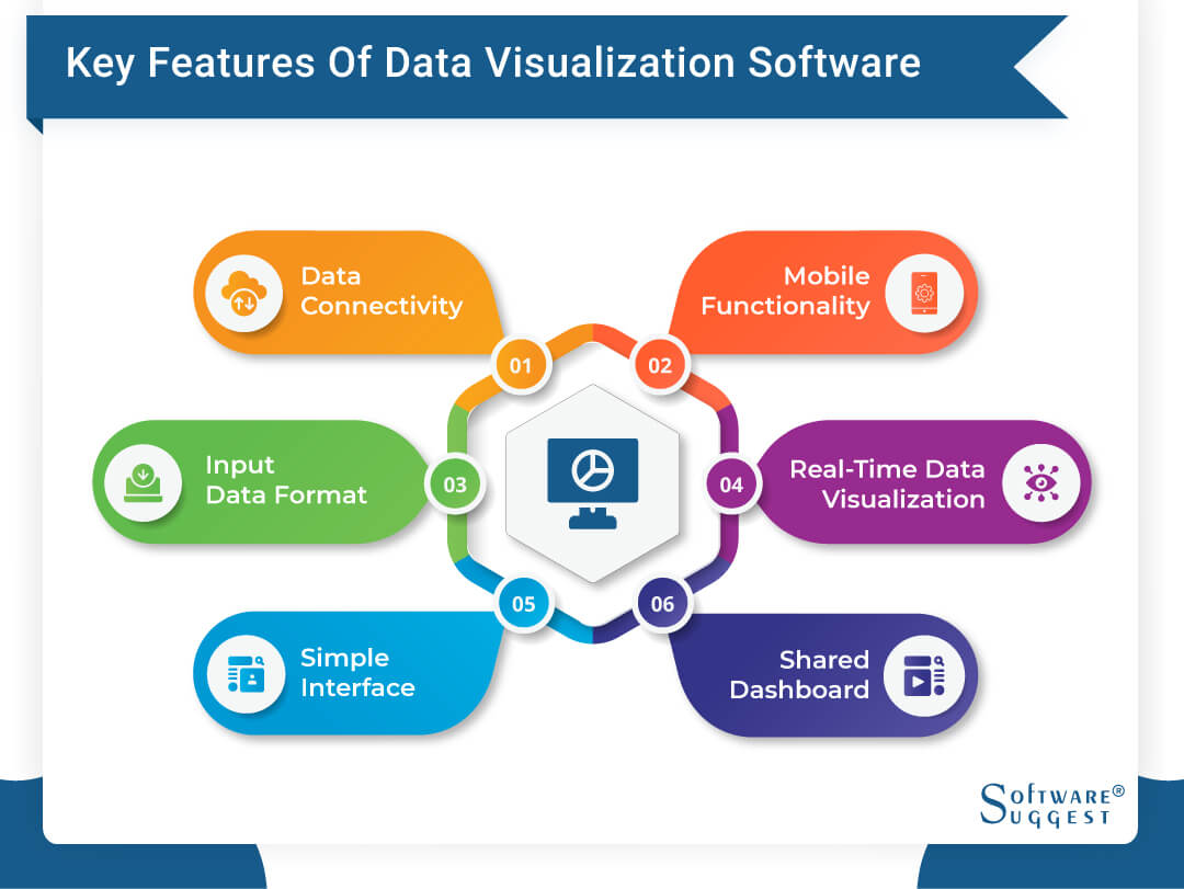
Here are a few standard features of the best data visualization tool.
-
Data Connectivity
Certain features affect the user experience. For instance, if you buy data visualization software, it’s crucial to see which source it can pull the data from for better results.
While analyzing data, data analysts need to be able to import data from all sources and not limit themselves to the data initially presented in the dashboard. For example, many visualization solutions can pull data from SaaS applications and build in-house systems.
Integrating with other systems and ingesting information from those sources is crucial in building interactive visualizations.
-
Real-time Data Visualizations
Another crucial factor in online data visualization tools is that they should be able to import data from different sources in real-time. This is particularly important if you want to observe and keep up with the latest trends and patterns in the business forecast. In addition, it allows your employees to improve on their strategies and work towards success.
-
Mobile Functionality
Today, businesses have gone digital, and employees work remotely. This has initiated the need to work on a cloud server to sync all the tasks and simplify complex data in real-time. This ensures that all employees are on the same page. At the same time, employees are often on the go. Therefore, they should have access to the dashboard of online data visualization tools on their mobile phones or tablets.
-
Shared Dashboard
In an enterprise, many stakeholders and decision-makers are involved. You must easily share the dashboard with other executives and leaders in the team for easy, quick decision-making. The tool should allow you to easily share visuals via email, instant messages, or any other medium. Besides, sharing metrics internally via email with your teams at regular intervals will keep them updated about their progress and effect.
-
Input Data Format
You should also look out for the data format in your visualization tool. You want the library to accept as many data formats as possible. The most common data format is JSON.
-
Simple Interface
User-friendly software has a short learning curve. Thus, choosing a data visualization tool with an intuitive and easy-to-use interface is crucial. This ensures that non-technical users can efficiently operate the platform and make the most out of it. In addition, make sure that the software comes with easily understandable manuals that provide essential tips on using the system.
What Factors Should You Consider While Selecting a Top Data Visualization Tool?

Choosing the best visualization platform requires tough choices to find the best fit for your requirements. Unfortunately, no single data visualization solution can fit all types of users’ needs.
Here are some key factors for picking great data visualization tools to help your business achieve its goals.
-
Ease-of-use
The term ‘ease-of-use’ about big data visualization tools may vary from company to company. The data visualization tools aim to explore the function (trend & patterns) behind the data. The device should be able to answer the question the user is looking for - the ‘why’ behind that data.
But the general concept of ‘ease-of-use’ applies broadly. It should be intuitive and have easy drill-down data visualization capabilities so that even non-technical business users can get started quickly.
-
Customizability
The next thing to consider while looking at various data visualization tools is their customizability. It’s crucial to have the ability to modify a default graph type. It could be from colors to removing gridlines and editing legends. These things will require modification, often based on your project.
-
Available Charts
The visualization you create depends on the following things – the question you are trying to ask, the properties of your visual data, and how you want to present your insights to others. Thus, your data visualization platform must offer various interactive charts. Therefore, it should have a library of a rich collection of graphs.
Knowing what you need to show makes determining how you want it easy.
-
Dashboard
You can choose to have an independent visualization tool designed to create one interactive chart at a time. Each interactive chart will enable a single data set. It works best for data journalists or public relations marketers. In the case of enterprises, they need to create a collection of visual components that are functional together. The visualization tool should offer a dashboard where all interactive graphs become easily accessible and work on multiple Google charts. It can be pretty helpful in creating internal reporting.
What are the Latest Trends in Data Visualization Tools?
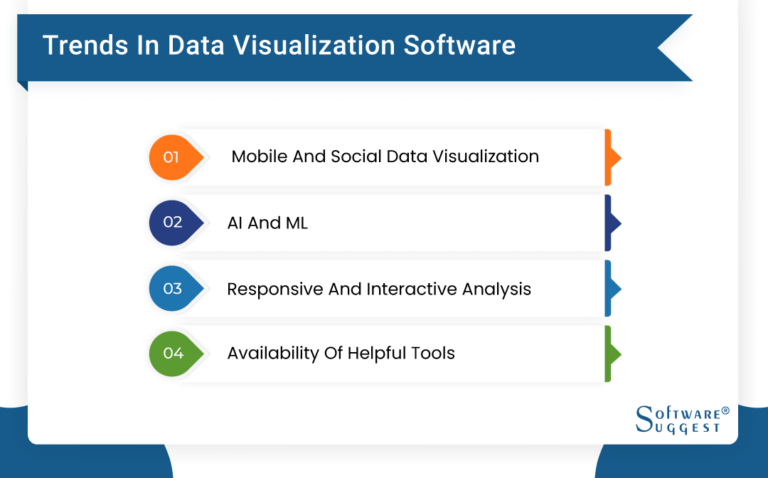
Some of the latest trends observed in online data visualization tools include the following –
-
Mobile and Social Data Visualizations
In recent times, the usage of smartphones has increased. Accessing data visualization tools online on mobile devices will only add to the customer experience. Most vendors realize that if the content is incompatible with mobile devices, it will only lead their customers to switch to competitors. Being on top of your mobile visualization capability will help you keep your customer base intact and acquire new ones.
-
Artificial Intelligence and Machine Learning
The penetration of AI and machine learning is increasing and is seen as an intelligent move to survive the competition. Create data visualizations backed by AI to ensure accurate data displays and increase efficiency. Besides, it saves employees from countless hours of performing hand tabulation prone to errors.
-
Responsive and Interactive Analysis
For the best data visualization tool to stand out, it must be agile. It should respond to visualizing data analysts' commands, including a drag-and-drop tool for creating dashboards and graphical illustrations. The purpose of having a responsive and interactive visualization dashboard is that it helps in effective communication between executives, employees, and other stakeholders.
-
Availability of Helpful Tools
Many vendors aim to improve their customer experience. Merely creating a dashboard and adding different functions won’t serve the purpose. That’s why solutions providers add many other valuable tools to their platforms, such as KPI dashboard widgets, tabular view components, and pivot tables. These tools can be pretty helpful in report generation. Moreover, they are trying to build an all-in-one platform whereby teams can easily collaborate to create reports and decision-making. You can even add those reports or dashboards to your company’s website.
Popular BI Visualization Tools for Data Visualization
Working from home in collaboration with remote teams is a standard working model now. However, working from home has its own challenges – including communication and collaboration. Data Visualization tools will help in overcoming these challenges.
According to statistics, tech teams are more productive when working from home instead of the office. For the tech teams of developers, managers, and designers, it is essential to have tools to visualize their thoughts when working remotely. Of course, they all use Slack or Skype, but it is not enough. There is a need for specialized software to showcase some data, analytics, graphics, and project results.
We have gathered a list of the top 15 data visualization tools offshore development teams can use to collaborate with their teammates and clients throughout their tech projects.
List of Top BI Visualization Tools for Analytics
-
Tableau Online

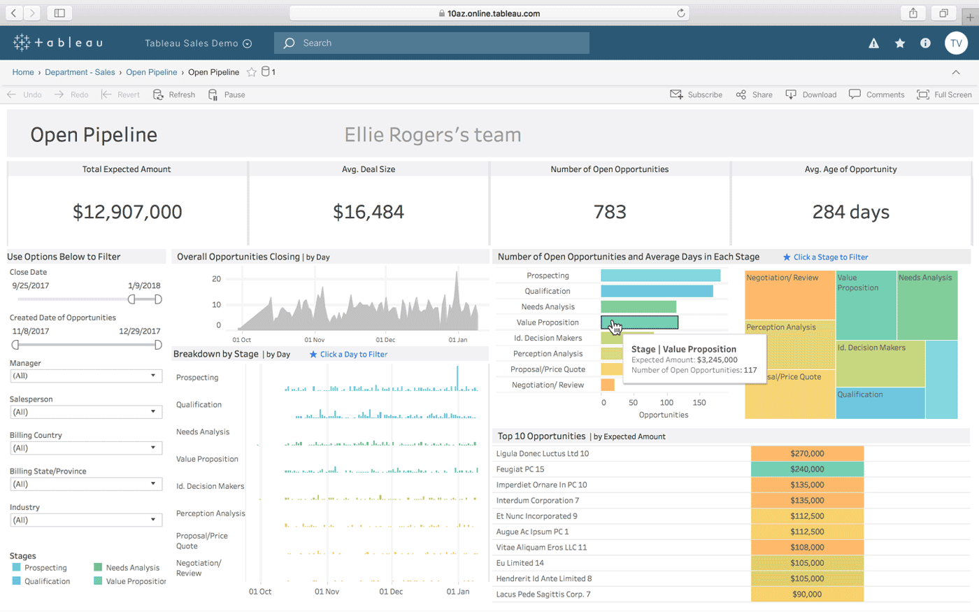
Developers employ various productivity, coding, testing, testing, and administering applications to plan, build, test, and implement cloud-management technologies. Although most systems have reporting and analysis features, technology teams may find it beneficial to construct their reporting skills to evaluate better, anticipate, and manage elements of their work. Tableau is a popular and effective solution for meeting those reporting requirements.
Pricing
It costs $500 per year per user, and there are no bandwidth or storage fees. Every account comes with 100 GB of storage.
-
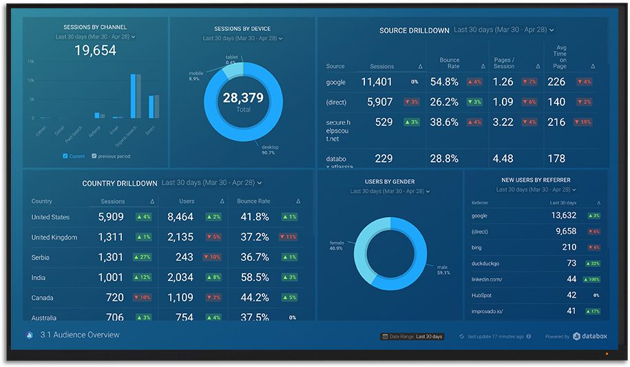
Databox
Databox is a real-time business analytics platform that brings all of your data together in one place so you can measure progress and identify insights. Combine data from several sources on a single dashboard to obtain a more comprehensive picture of your performance in a quick glimpse. Databox has many one-click connectors with Google Analytics, HubSpot, Mixpanel, Facebook, and more services.
Pricing
Databox's monthly price starts at $59.00 per feature. A free version is available. A free trial of Databox is available as well.
-
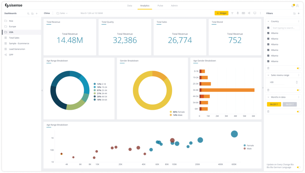
Sisense
Sisense is a flexible business intelligence (BI) system with powerful analytics, visualizations, and reporting capabilities for managing and supporting company data. Businesses may use the solution to evaluate large, diverse databases and produce meaningful business insights.
Pricing
Potential Sisense customers must fill out a request-for-quote form on the company's website under the "Pricing" tab to obtain a personalized price.
-
Infogram
Infogram is a data visualization tool for marketers, strategic business executives, media businesses, and other professionals. Thanks to the dependable program, the user may generate compelling images and stand out with data-driven content. It also comes with a collection of tools for structuring data to impress customers and coworkers.
Pricing
The basic version is free, but access is limited. The Pro version costs $19 per month if paid annually; otherwise, it costs $25 per month. Aside from that, the cost is determined by various customizations and is different for different customers.
-
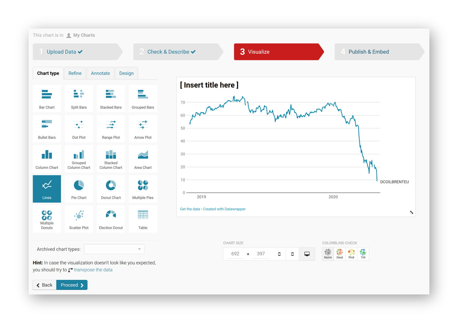
Datawrapper
Datawrapper is a data visualization and compilation program that makes showing vast amounts of data easier. Journalists, software developers, and other design professionals who need to compile data in any format may find it helpful.
Users can select several maps and charts depending on the design and presentation style required. Datawrapper's design aims to be adaptable enough to accommodate various bespoke chart designs appropriate for the newsroom.
Pricing
They offer a free plan with limited access. The custom plan is €499 per month, while the enterprise plan gives prices that depend on the individual's customizations.
List of Top Business Intelligence Visualization Tools for Programming
-
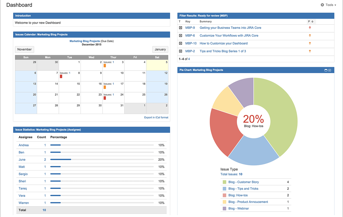
Jira
Jira is a software application that assists users in defining, assigning, and setting task priorities. It helps users manage application development, covering all process aspects, from concept to implementation. It offers a basic intuitive interface that facilitates good communication and allows for more efficient work completion.
Pricing
There is a free trial for the first seven days, a small team plan for $10 per month for up to ten users, an expanding team plan for $75 per month for up to 15 users, and the ability to scale up to 2000 people at an additional cost.
-
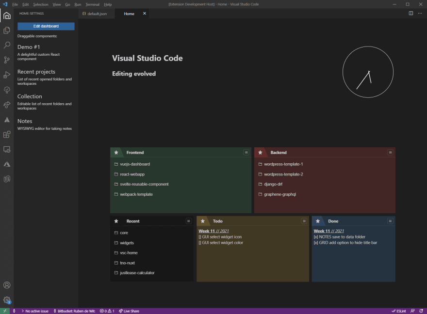
Visual Studio Code
Microsoft Visual Studio Code is a free coding editor that allows you to code in various programming languages without switching editors. One of Visual Studio Code's main features, such as those of other decent code editors, is its customizability. You may alter the theme, add other languages and debuggers, and connect to other services via extensions.
Pricing
One of the most appealing aspects of Visual Studio Code is that it is entirely free. All you have to do is select the appropriate version for your OS, download it, and run it.
List of Top BI Data Visualization Tools for Designing
-
Canva
Canva is an online service that allows anybody to design anything with ease. With countless professionally produced templates to choose from, you can create, tweak, and share your creations. It's never been easier to fulfill your creative goals, from posters to pamphlets, gorgeous animations to professional presentations.Canva's monthly price starts at $12.99 per user. There is also a free version but with limitations.
-
Markup Hero
Markup Hero helps in capturing ideas, efficient communication, and saving time. You can quickly record and share ideas with Markup Hero's screenshot software and picture uploader. With simple annotation tools, you may convey your ideas on any image. You can save time by rapidly accessing your screenshots and notes and making changes on the fly.
Pricing
Markup Hero provides a free trial as well as a limited free version. Its monthly fees start at $4.00 per user.
-
Visme
Visme revolutionizes how you produce and distribute compelling PowerPoint presentations, charts, and other graphic media. Visme is a content creation platform that IBM, General Dynamics, Accenture, and 4.5 million other users use to tell and convey their ideas and turn dull statistics into compelling visuals.
Pricing
Visme is available for $19.00 per month. A free, somewhat restricted version is also available.
 Canva is an online service that allows anybody to design anything with ease. With countless professionally produced templates to choose from, you can create, tweak, and share your creations. It's never been easier to fulfill your creative goals, from posters to pamphlets, gorgeous animations to professional presentations.
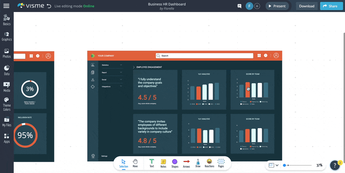
List of Top BI Data Visualization Tools for Presentations
-
Powtoon
Powtoon enables anyone to get simple, stunning results by transforming personal interactions into visual experiences that inspire their audience to engage, interact, and perform. The all-in-one platform makes designing completely customized and helps easily create professional films.
Pricing
Along with a free trial, PowToon charges its customers $89.00 per month.
-
SlideUpLift
SlideUpLift is an online platform of 30,000+ PowerPoint and Google slides templates to help professionals make compelling presentations using vision science and storytelling principles. These templates are 100% editable and ready to use. You can create persuasive and engaging business presentations in just a few clicks using their vast library of editable PowerPoint, and Google Slides themes.
Pricing
A Free Plan is available. However, the membership plan starts at $49.99.
-
Pitch
Pitch is an interactive presentation program. It focuses on real-time collaboration, intelligent processes, and simple design elements to make things simple for teams to develop and deliver great presentations and for anybody to draw insight from expert-crafted templates. Large teams, including prominent businesses such as Notion, Intercom, and Superhuman, have used the pitch.
Pricing
A free version is available. However, pitch charges a flat rate of $10.00 monthly and does not offer a free trial.
-
VideoScribe
Users can create their films using VideoScribe without complex software, stop-motion animations, or expert assistance. As a result, thousands of people use it worldwide, including advertisers, design companies, enterprises, NGOs, and teachers.
Pricing
VideoScribe's price starts at $25.00 per month as a fixed charge. There is no free version available.
List of Top Data Visualization Tools For Developers: Javascript Libraries
-
D3.js
A JavaScript library for data-driven document manipulation, D3.js uses HTML, SVG, and CSS and allows you to bring data to life. With powerful visualization elements and an informative approach to DOM manipulation, D3 gives you the full potential of current browsers without restricting you to a commercial platform.
Pricing
It has a quote-based plan for which the customer must contact the vendor.
-
Ember.js (Ember charts)
It is an open-source JavaScript web framework built on the Model-View-ViewModel design paradigm. Ember's Handlebars integrated templates update instantly as the input data changes, allowing you to write relatively lesser code. Ember.js uses common patterns so you can concentrate on what makes your project unique. Ember.js was created with efficiency in mind.
Pricing
It is free.
Related Articles:
FAQs
Data visualization helps understand the information behind all the data. It comprehensively presents data, highlighting the trend and outliers.
Excel isn’t a data visualization tool but a spreadsheet. That being said, it gives additional functionality for preparing data for analysis in data visualization.
There are several standard data visualization techniques used charts (line charts, pie charts, bar charts, etc.), plots (bubble, scatter, box, etc.), creating interactive maps (heat maps, geographic maps, dot distribution maps, etc.), matrices, and diagrams.
By Countries
By Industries