
We reside in an era where the amount of data is so vast that it is difficult even to imagine how to manage and analyze it. Businesses have started accumulating so much amount of information that handling it through Excel, PowerPoint, or static reporting is quite challenging. Nevertheless, technological advancement has demystified this issue with resources such as online data analysis. Yes, you can leverage the power of interactive dashboards and get rid of conventional ways of analyzing data.
If you aren’t aware of benefits an interactive dashboard can bring, here’s a quick overview!
Interactive dashboard refers to a data management tool that is efficient in tracking, analyzing, monitoring, and displaying business metrics. It enables users to interact with the data and make informed and data-driven business decisions. Moreover, the interactive dashboard allows different departments to collaborate more effectively.
Here, we are going to review one of the most compelling interactive dashboard tools on the market – datapine.
Introduction to datapine
datapine’s dashboard tool helps businesses build and share stunning dashboards in just a few clicks. With datapine, you can customize dashboards, automate reports, access key business metrics, and monitor all relevant business information on a single platform.
datapine lets you build an interactive dashboard in three simple steps!
Step 1: Connect Your Data
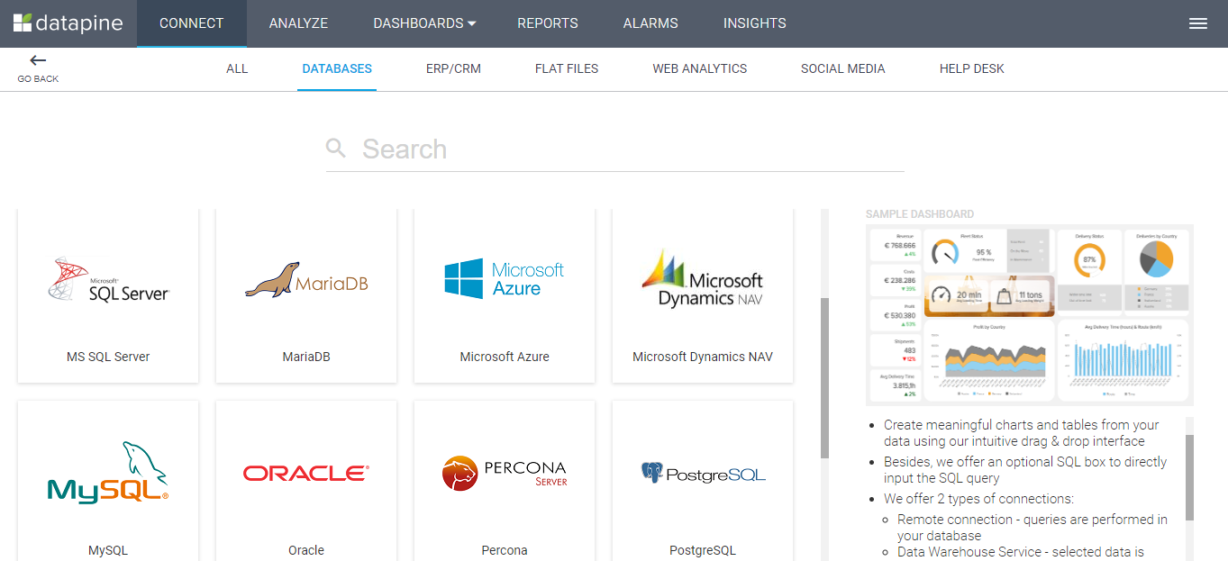
To start working with datapine, you’ll require connecting the data you want to analyze. These connections are referred to as ‘Data Sources’ by datapine. It allows you to connect to many different data sources.
Step 2: Select a Dashboard Template
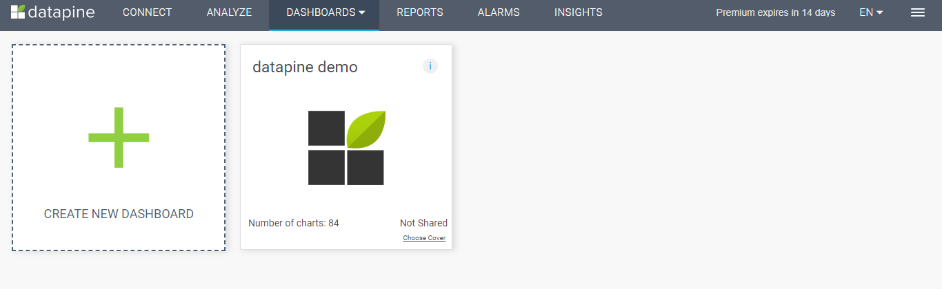
In the Dashboard section, you can create a new dashboard and access the existing ones, too. datapine offers over 80 pre-styled dashboard designs and layouts to choose from.
Step 3: Build / Edit Your Charts
In the Analyze section, you can build and edit your dashboard charts by a simple ‘drag and drop’ functionality. You can add advanced functions like custom formulas, conditional formatting, forecasts, and trends.
Now that you are acquainted with the general working flow of datapine, let’s take a look at the core components this dashboard software offers.
In-Depth Analysis of the 6 Main Components of datapine’s Analytics Platform
1. Connect
Here, you will see a connection screen that lets you connect your data sources. You can add, edit, merge, update, or remove your data sources as per your requirement. Various data sources are supported by datapine, including databases, CRM and ERP systems, flat files, Google Analytics, social media platforms like Facebook, Twitter, or Instagram, and other customized API connections.
2. Analyze
This component helps you create actionable insights depending on the data you connect. The information is then stored in the form of charts and graphs on your dashboard.

To make the most of your data and build a stunning interactive dashboard, datapine offers several visualization tools. It helps you gauge and analyze your business data in just a few seconds.
- Visualization Types: Picking the right chart, table, or graph is crucial to make your dashboard more interactive and visually appealing. datapine provides numerous visualization types that assist you in extracting hidden information, highlighting trends, outliers, and more.
- Chart Creator: You can choose from a range of chart styles, graphs, and style options available. It enables you to build robust and dynamic dashboards.
- Calculated Fields: When you require additional calculations, you can create custom fields to mix them, as well as functions, to get exactly what you need. It lets you create customized fields and build cross-database metrics. You can also insert notes explaining your custom calculations or formula so that other users can understand it.
- Predictive Analytics: In 4 simple steps you can take advantage of predictive analytics for reliable forecasts: 1) Choose the variable / KPI to forecast, 2) Specify the amount of data points for the output, 3) Define which past data points should be used for the prediction and if more recent periods should have higher weights, 4) Select the model quality by choosing a required confidence interval.
- Formatting: datapine lets you apply various formatting options to your charts. It includes labels, color, axes, and trends. You can also decide on the chart area, font style, font size, font color, and more.
- SQL Mode: This is specifically for data analysts with excellent SQL skills. They can enter SQL code manually and get the visualized results instantly.
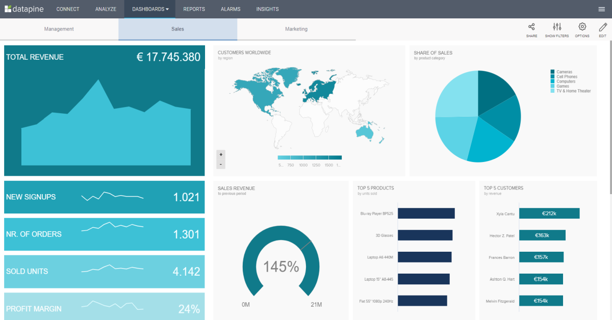
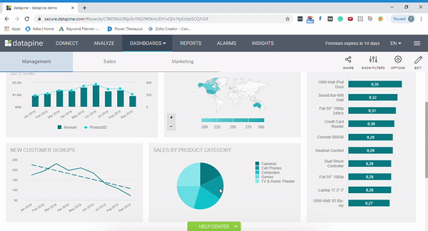
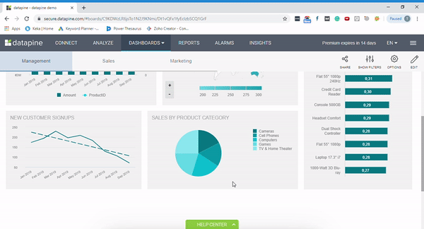
3. Dashboard
The dashboard section is the core element of datapine’s analytics platform. It is where you can fascinatingly represent your analytics results. You can save your insights, view stories, and share the same with people inside and outside your organization.
When you click on ‘Create New Dashboard,’ you’ll be provided with over 80 pre-styled dashboard designs and layouts. You can fill the charts with your information and get a ready dashboard.
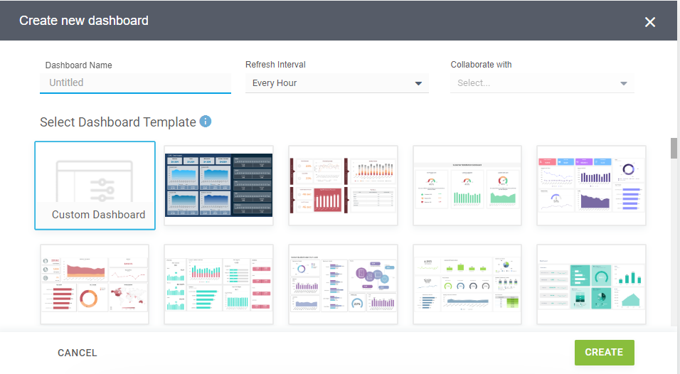
If you want to develop a dashboard from scratch, you can select ‘Custom Dashboard.’ You can name your dashboard, choose with whom you want to collaborate, and define the Refresh Interval. Here, Refresh Interval is the duration when you want datapine to query your data source.
For an existing dashboard, you can view the number of charts it contains if it is shared with users or not, and how many tabs it comprises. You can also change the cover of your dashboard if you wish.
Here are some interactive dashboard features that datapine offers
- Click-to-Filter: An interactive dashboard provides a number of ways to dissect the represented data. Click-to-Filter enables you to explore the data you wish on the interactive dashboard. Simply click on any given data set in your charts, and the system will apply a quick filter to the relevant data on your dashboard and offer you new insights.
- Chart Zoom: Robust interactive dashboard software like datapine offers you to get a 30,000-foot view of your data on a chart with zoom in and zoom out functions. You can simply drag your mouse on the portion of the chart you want to view and scroll in upside down or vice versa to enlarge and reduce the chart respectively.
- Show/Hide Chart Values: To manage the combined data in a chart more efficiently, show/hide chart values is a must-have feature of an interactive dashboard. It helps you view only the data you wish to see with just a simple click of your mouse.
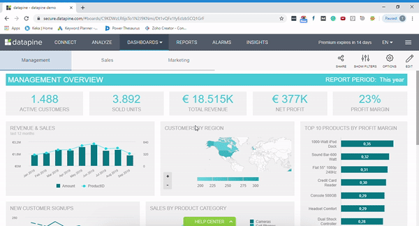
- Drill down: It is a neat feature of the datapine dashboard software that allows you to dive deep into a particular element. That means you can double click on a given variable or KPI to obtain detailed information about it. For example, taking a closer look of the total revenue on a map chart in the example below.
- Widget Linking: datapine’s widget linking helps you unify the dashboard and take your storytelling to another level. It allows you to add links to any widget on your dashboard – be it a graph, chart, image, or a textbox. You can even link to other websites or resources if needed.
- Hierarchical Filter: This feature offers you a comprehensive look at how one filter can affect the other. Suppose that you want to apply the filter on specific ‘Product Category.’ With changes in this, the ‘Product Name’ filter will automatically get updated. Adding such a feature on your dashboard enables you to work more effectively and accurately with your dashboard.
- Time Interval: This is an in-built dashboard software feature. It lets you study the given information on a daily, weekly, monthly, or yearly basis. You can change time intervals of a particular chart easily without letting the other data get affected on your dashboard.

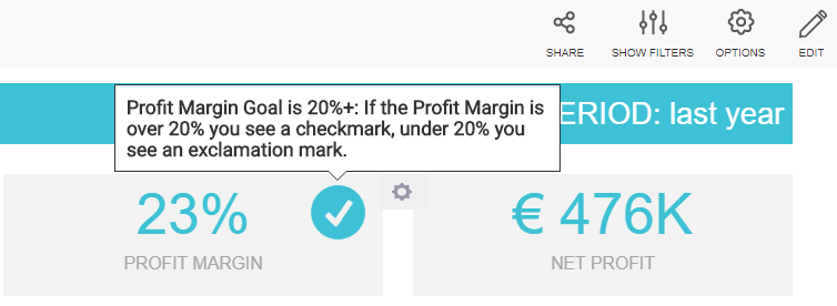
- Dynamic Text Boxes/Images: Monitoring performance daily is quite troublesome. It consumes a lot of time and demands you to put enormous efforts. But, with dashboard software like datapine, you can simplify the process by using dynamic textboxes or images. Imagine these scenarios:
i) If a particular KPI possesses a value under your specified benchmark, it will display an exclamation mark. Thus, you can quickly identify that it is underperforming and requires your attention.
ii) If an element is performing well, a checkmark will appear on it. Hence, you can be assured with the performance of that element and focus on other areas.
- Information Tooltip: When it comes to presenting a report, there is much information that you require explaining your viewers. With its information tooltip feature, datapine lets you add specific explanations which pop up as soon as you bring your mouse cursor over it.
4. Reports
You can send your dashboards in certain intervals via email to one or more recipients. You can choose to create a report as per your requirement.
- Standard Report: It lets you send the same dashboard to all the recipients.
- Customized Report: You can send a dashboard to a group of recipients, each with a recipient-specific content. To achieve this, you can assign filter values to each of your recipients.
5. Alarms
datapine lets you create intelligent data alarms. These alarms monitor selected metrics as set by you and notify you whenever they notice any anomalies. You can select between these 3 alert types: neural network alert, pattern recognition alert, and threshold alert.
6. Smart Insights
This component from datapine analyzes your data and automatically generates multiple types of insights. It includes:
- Growth and Forecast
- Value Drivers
- Key Segments
- Outliers
- Correlations
- ‘What If’ simulations
Summary
With a myriad of interactive dashboard features and functionalities, datapine provides you with an excellent way to create professional dashboards and present your data in the most meaningful way.
Its secure Software as a Service infrastructure enables you to access your data from anywhere, at anytime, as long as you have an Internet connection. In general, their interface is really intuitive and makes analytics available for business users, too.
You can explore more about Datapine on its website or SoftwareSuggest’s Profile Page.
SoftwareSuggest empowers businesses to discover top business software and service partners. Our software experts list, review, compare and offer a free consultation to help businesses find the right software and service solutions as per their requirement. We have helped 500,000+ businesses get the right software and services globally. Get a free consultation today!


